Pages

Thursday, February 28, 2013

Penny Candy - CKC March Kit Reveal Blog Hop

IF YOU ARE LOOKING FOR CHALLENGE #1 FOR SKETCHES: CREATIVELY YOURS, PLEASE SCROLL DOWN TO THE NEXT POST.

Here we are again with a blog hop to see how the Master Forgers have interpreted our inspiration kit.  You should have arrived here from Lisa J's blog or if you've just stumbled in, go to the Counterfeit Kit Challenge blog to start from the very beginning and work your way through all of the inspiration.

Let's take a look at our inspiration kit, "Soda Shoppe" by Noel Mignon.


I love the variety of papers and embellishments and the pop of turquoise and yellow.  There's something about it that feels very fun and youthful.  It reminds me of my days as a girl scout at Camp Hoover in the remote northwest corner of New Jersey.  Each Fall, we would take a weekend encampment and our trip would end with a walk to the local town's general store.  Inside, there was a classic, old-fashioned penny candy counter with a little old lady who would patiently listen to all of our confectionery requests and fill  brown paper bags with candy dots, Swedish fish, Pixie Sticks and Tootsie Rolls.  It was always so exciting to make these purchases and even more exciting to eat all of the sweets on our walk back to camp.

So, in an attempt to recreate this experience and combine it with scrapbooking, let me present to you my March Counterfeit Kit...

Penny Candy

Now, just like in the old days, each item is one for a penny. Count how much money you have and let's take a closer look so you can make your choices.


Mr. Owl seems like he would fit in just right at Camp Hoover and with the Girl Scouts.


Paper straws reminiscent of Pixie Sticks and washi in a variety of candy colors will dress up a layout nicely.


Yellow distress ink, a chevron mask and some little white bags were an easy counterfeit of the ones in the inspiration kit and a perfect place to store your candy treats. Ka-ching! That will be 12 cents, please.


Epoxy "candy" dots resemble the ones in the inspiration kit. Close enough for me!


So many choices! So many sweet layouts to come!

Next stop will be Milissa.

Guest Designer: Dawn: http://dawnsscrapbookcottage.blogspot.com/
Andrea http://snappingmonsters.blogspot.com/
Angela http://colestoucan.blogspot.co.uk/
Jemmahttp://just-jimjams.blogspot.com/
Jennifer http://www.jennifersjumbles.blogspot.com/
Julie http://www.hisglorygirl.blogspot.com/
Libeetihttp://creationswithlove-li-bee-ti.blogspot.com/
Lisa H.http://lisahausmann.blogspot.com/
Lisa J.http://thesimplelifewithlisa.blogspot.com.au/
Lynnette http://sassyscrapper2010.blogspot.com/ YOU ARE HERE!
Milissahttp://millermall.blogspot.com/
Rebeccahttp://howiburb.blogspot.com/

Thanks for taking a stroll down memory candy lane with me! Be sure to check back throughout the month to see how my Penny Candy Shop is transformed into scrapbooking memories.

Sketches: Creatively Yours - Sketch Challenge #1

For the most part, scrapbooking is so much fun, but there are times when it can be overwhelming.  I often get stuck on where to start.  That's when a sketch is so helpful to get the creative juices flowing.  Here's the March layout sketch from Sketches:  Creatively Yours by Ali MacDonald.


I was immediately drawn to the large treble clef sign and started to think about what kind of large embellishments I own that would make a statement.  I remembered an over-sized flair button I purchased just recently on a trip to Lake Placid, NY.  Let me show what I did with that button...


Once I decided on that flair, the story came together easily.  Stinky hockey gear!  Ewwww!  And of course, I know that phrase is "wreak havoc", but "reek" just fit so perfectly.  I love coming up with clever titles!


I had fun making my green Mister Huey spray mist act as the skunk's spray!  Luckily, it has no scent at all.


My son has a good sense of humor, so he didn't mind that I officially called him stinky!

I hope this sketch inspires you as much as it did me.  I can see using it again and again to showcase multiple pictures and one big "wowzer" of an embellishment!


Wednesday, February 27, 2013

Getting to Know Me

TWO BLOG POSTS IN ONE DAY!  A NEW RECORD FOR ME!  SCROLL DOWN TO THE NEXT POST TO SEE WHERE I'M GUEST DESIGNING IN MARCH.

Welcome to our Special Edition blog hop for Counterfeit Kit Challenge.  The purpose of this hop is for everyone (design team members and fans of CKC) to get to know each other better.  Sure, you can click on my little bio on the side, but here's a chance to get to know the little ins and outs about Lynnette.

In order to get us started, Rebecca (one of our CKC organizers) provided us with these great journaling sheets courtesy of Christie Zimmer from her blog, graceisoverrated.com.  We were to fill out the sheets and be inspired by our responses to create something...anything...to help you all get to know us better.

So, here the sheet I completed:


I chose to focus in on the section of the sheet that highlights our "Bests".  It seemed like light and interesting things that you may not necessarily know about me unless you specifically asked.  As for how I turned this into a project?  Well, I've been creating a ton of layouts for CKC and the Layout A Day challenge, so I decided to take a different approach.  As I was cleaning up the wreckage in my craft room due to the flurry of activity I noticed this:

I immediately thought it would make an interesting mini book of sorts for all the "Best" answers from my journaling sheet.  So, with scraps of Echo Park's, "Hello Summer" kit in hand, I started transforming this cardboard ribbon spool into a helix of memories.  Here's my result:


Let the good times roll!  Here's what's inside:


It was a little tricky to photograph, but here's my best attempt to show you my "Bests":

Things that make me happy!


Wow!  That was so much fun!  Thanks for taking the time to get to know me a bit better.  Be sure to hop on over to all of our participating design team members to get the inside scoop on them.  The hopping "road map" is listed below.


Angela http://colestoucan.blogspot.co.uk/
Jemma http://just-jimjams.blogspot.com/
Jennifer http://www.jennifersjumbles.blogspot.com/
Julie http://www.hisglorygirl.blogspot.com/
Lisa H. http://lisahausmann.blogspot.com/
Lisa J http://thesimplelifewithlisa.blogspot.com.au/
Lynnette http://sassyscrapper2010.blogspot.com/ YOU ARE HERE!
Milissa http://millermall.blogspot.com/
Rebecca http://howiburb.blogspot.com/
And that's how I roll!


Exciting News! A Guest Designer Spotlight!

I am so thrilled to be spotlighted as the March guest designer over at Sketches:  Creatively Yours, a fun, free and inspirational sketch blog.  I believe it was May 2010 when I met Ali MacDonald (team leader of S:  CY) during Lain Ehmann's Layout A Day challenge.  She started a thread on the discussion board offering crock pot recipes to save time for scrapping and my ears perked up right away.  I've since become a member of her facebook resource, "Ali's Recipes to Share" and many of the recipes from there have become mainstays in our menu rotation.

As for a scrapper, I've always admired Ali's work.  She shares so many beautiful photographs of her family and through her journaling it is evident how much she is devoted to them.  She always chooses perfect embellishments and always adds just the right amount of distressing or inking to set her elements apart.  In addition, Ali is such a supportive and encouraging friend.  She is always active in commenting providing meaningful feedback.   I only wish Close to My Heart would allow her to sell internationally as I would be a  faithful customer for sure!

If you are looking for some inspiration and an encouraging pat on the back, check out Sketches:  Creatively Yours.  Whether your style is clean and simple or more elaborate and decorated, the sketches are versatile enough to meet your needs.  I am excited to add this resource to my scrapbooking repetoire.

Saturday, February 16, 2013

Working the Kit

Participating in the Layout A Day Challenge is certainly giving my kit a workout.  While I'm not using it for every layout, it is a great resource to have on hand.  In the past I have stored my kit in one of those Iris boxes, but I find that it's hard to see all that I have available to me.  I am fortunate that a good portion of my finished basement is dedicated to my scrapping, so I have decided to use the space to set up a card table to keep my monthly kit visibly ready to go.  I can spread things out a bit and nothing gets lost at the bottom.  And to keep things moving forward for the next month, I placed a plastic bin underneath the table to start collecting supplies for the new kit to come.  Seems like I worked out a system for this fast paced scrappy life I've signed myself up for!  I love it and wouldn't have it any other way.

So, here are 3 more layouts I have created from my February kit, "Prep School":


The blue and green theme of the kit really shines through as I look at all three of these layouts stacked up on the blog.  I love that color combination.  

On "Half Girl Half Bunny", you can see I got very brave with my mists.  I loved the idea of using old chipboard letters as a mask to create my title.  I will definitely use this technique again as I am thrilled with the results.

I struggled with the design on "Proud as a Peacock".  It took way too long to make this one work, but I am pleased with the results.  The October Afternoon peacock paper was a MUST for this page (and mimics a similar paper in the inspiration add-on kit) and I had fun creating those peacock feathers - complete with washi detail.

The last layout also has a "proud" theme.  I love the use of the varsity letters and the notebook edge to really bring home that scholastic theme.  This layout was inspired by the LOAD prompt of scrapping something you hear.  This was a phrase my parents said to me every morning before school.  I pried off the medallion from one of my drum major plaques to use as an embellishment.  I don't have these achievements hanging on my walls anymore, so it gets more glory here than sitting in a box in the attic.

My kit is coming down to just scraps, which is a good feeling.  Glad to be creating and documenting so many memories.

Tuesday, February 5, 2013

Speech Bubble Challenge

While one would usually expect to see speech bubbles coming from people, I decided to have my speech bubble for the CKC speech bubble challenge come from an inanimate object.  Shown in the layout below, my treadmill is almost taunting me.


This layout was completed as part of the Layout a Day Challenge.  The prompt was to think about goals.  Maybe it's that the treadmill is in my craft room and scrapping always trumps exercise!  I am serious about moving more so I do intend on keeping to this goal.  

So.....I guess I gotta go walk on the treadmill (sigh).

Monday, February 4, 2013

Peak Season for Scrapping

February may be my favorite month of the year to scrap.  Long, cold winter days lend themselves to inside time for creating.  The holidays are over and there's a lull in activity.  I quite enjoy the calmness.  February is also the month for Lain Ehmann's Layout A Day scrapbook challenge.  If you are not familiar with this online challenge, it is a month long pledge to create a layout each and every day of the month.  Lain provides thought-provoking prompts that challenge you to step outside your comfort zone.  

So far this month, I've created 3 layouts (yes, I'm right on track).  While I will utilize my February Counterfeit Kit, "Prep School", sometimes I do have to refer back to my general stash for papers and embellies that really suit the page.  The first LOAD challenge had us leaving out all words on the page, which is kind of ironic since the first CKC challenge of the month had us only journaling and omitting photos.  Talk about shifting gears!  Choosing poignant photos and embellishments to tell the story was key here. 


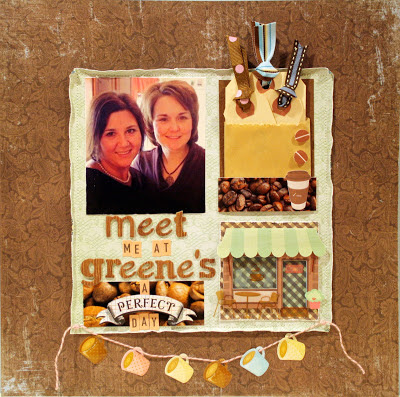
Day 2 had us scrapping a perfect day.  Nothing better than a cup of joe with my bestie, Tara.


And finally a layout with my CKC kit!  A silly play on words for the title highlighting an under appreciated, yet very useful part of my daily life - my crockpots.  Choosing from my assortment of goodies made this layout come together in a snap.


So, that's what has been happening at my scrap table lately.  Thanks for stopping by.


Saturday, February 2, 2013

I'll take one layout...hold the photos.

That was the order we were given for the first assignment at Counterfeit Kit Challenge.  That's right...a layout  with no photos...only journaling detailing something we love.  Now, I am not scared of journaling.  I love to write and always have something to say, but I also really enjoy having photos to support my story.  For me, the biggest challenge would not be writing, but filling up all that real estate on my page.  How would I make it visually appealing?  What kind of techniques would I use?  How would my embellishments support my story since I didn't have photos to do that job.  Here's what I came up with:


I had considered creating an 8.5x11 page to cut down on my ground to cover, but the October Afternoon chipboard pieces and some DCWV polaroid pics (thanks, Leslie) came to the rescue to help support the theme of my page.  And what luck that the film strip had exactly 6 spaces to fit the word "camera".  Love when it all works out like that!

In case you can't make out the journaling, here is a close-up:


I placed it front and center, as you might do with a photo, and highlighted it with some strips of patterned paper.  I'm so glad I have this story down as my camera is such an important tool in my memory keeping and I am so grateful to my grandparents to be able to own it.  I hope they are watching down and smiling as I record our family's stories.

Well, I finished this layout a few days ago and submitted the photo to CKC for their blog post.  While I was very pleased with the overall results, I thought something was missing.  I felt the stitching I had done around the denim block just didn't set it off against the manila ledger paper as I had hoped.  It then hit me as to what it needed.  Take a look and let me know what you think:


There, that's better.  The black and white chevron washi really livens up the whole layout and brings out the black in the camera.  Sometimes you just have to step back from your layout a bit and get some perspective.  I wasn't unhappy before, but I am much happier now!

So, don't be intimidated by a journaling-rich layout.  Find some embellishments that fit your topic and let them and your story take center stage.

Say Cheese!