My Little Sketch Book
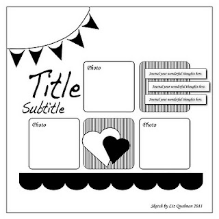
I kept true to the overall layout, but did change things around a bit. I liked the squares with the rounded corners, but really only had 2 pictures that I wanted to use. I knew I wanted to stencil the word GO! and that needed to be on the background paper so it would be visible. So, scratch the title in the left hand corner. Add a border strip of banners across the bottom vs. on the top corner and I knew I HAD to include that "Enjoy the Ride" journaling sprout in the bottom corner. I fussy cut those butterflies from a piece of Jillibean Soup paper that I bought special to go in this month's kit (shhhh...don't tell! I've been trying not to make special purchases for my kits, but this one I couldn't pass up.) and thought they added excitement and movement...just like the mood of the event. And there you have it. Followed the sketch, but made it my own. Now it's your turn to try out this sketch...on your mark...get set...GO!

Oh you made it your own, and super cute too - I like your journal circle and embellishment circle at the bottom.
ReplyDeleteI love what you did with the sketch! I struggle with the same exact issues you do with a sketch. And yes, it IS a love-hate relationship! I find that more often now days, though, I get more ideas from the finished layout example than I get stuck from the finished layout example. For example, here, I LOVE your title treatment!!
ReplyDeleteWell, I would never have known that you were uncomfortable with sketches - this is amazing! You really made it your own and how wonderful it is! The butterflies are just perfect. I haven't done this sketch yet, but I might give it a go now that I've seen your wonderful version!
ReplyDeleteI love what you did with the sketch. Love your product choices. It's so pretty!
ReplyDeleteWonderful take on the sketch! I love those butterflies and the stenciled title!
ReplyDelete